Whilst furniture, lighting, installations and spritzers might offer the core content on offer during Milan Design Week, where, and indeed how, they are delivered plays a huge role in how they are received and ultimately how they are remembered.
Here are my picks for the exhibits that caught my eye for the way in which they were styled – the use of materials, colour selection and overall design of the space…as well as the products on show within!
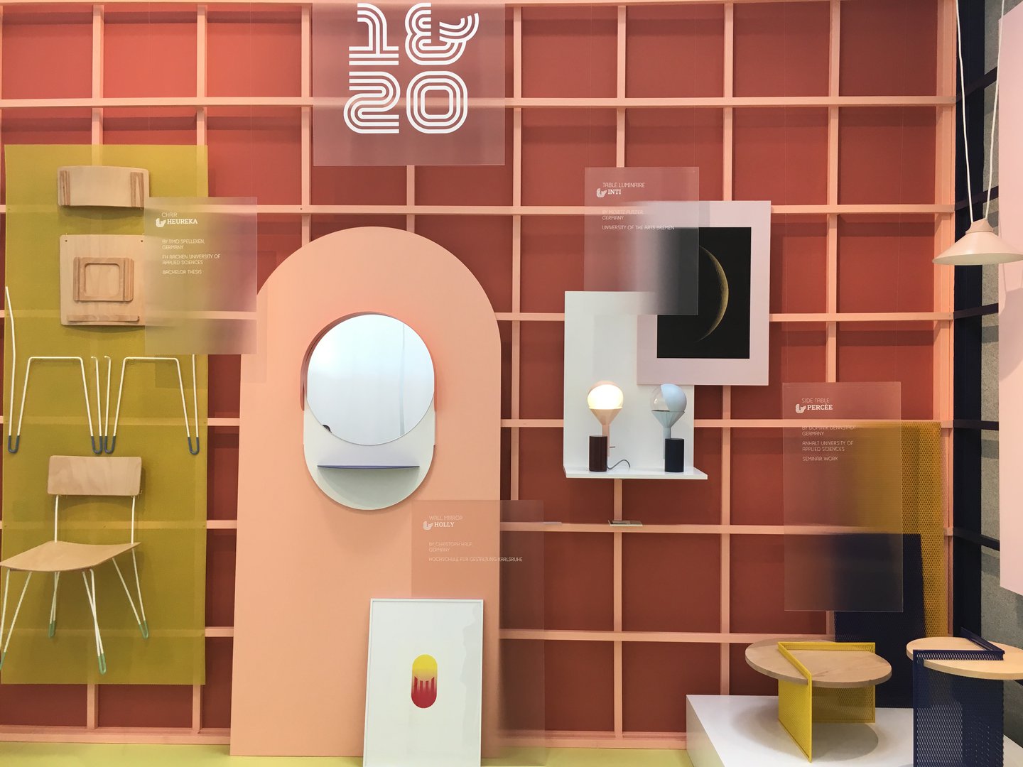
This year’s show gave a platform for the inaugural exhibition of the German Design Council's new international design competition for students and graduates. There was a host of outstanding work from designers from across Europe, and as far as Canada – all of which was carefully curated in four beautifully styled quadrants by Besau Marguerre.
Each zone had its own chromatic ordering, with blue, monochrome, natural timber tones and a vibrant contemporary palette of peach, mustard yellow and navy blue clearly dividing the areas. Through each space a gridded hanging system was used with labelling and graphics applied to frosted and textured acrylic sheets, to create an optical blurring effect.


As Wendy Plomp, founder and curator of Dutch Invertuals explains, the group showing is always one of exploratory and ambitious design investigations: "We project our visions into the future to guide progress."
This year Harvest brought together a body of work engaged in the questioning of efficiency and self-sufficiency, examining and attempting to redefine how we might design and work with materials as a resource in producing functional products. Work by 10 design studios was shown on floating islands of various angular sheet materials, including coloured MDF, fabric, acrylic and laminate, creating an intriguing landscape of potential future objects.


This was a show that stood out last year too. Beautifully designed interior products were once again perfectly framed by materials and colour, this time selected by designer and interior architect Katrin Greiling.
My particular favourite was the clever fabric cut outs; large drops of heavy material with door-like gaps left for plinths with exquisite objects atop to reside.


Over at Ex Casa Dell’opera Nazionale Balilla, the former home to a school for teaching children the way of fascism in the early twentieth century and later a theatre, Karpeta and Texturae came together under the creative direction of Chiara Andreatti to showcase their superb rugs and wallpapers.
The maze of rooms were richly adorned with hanging layers of said products, as well as a sumptuous colour palette that gave the space a wonderful presence.


Colour was a primary focus in the styling of Matteo Zorzenoni ’s ‘micro sets’ over in the new satellite Ventura Centrale location.
Each of the oversized crate-like pods were painted out in a bold but fitting singular colour, with repeated graphic lines set into the surfaces of the walls, all of which drew visitors in like moths to a flame, ready to then take note of the lighting and interior products neatly arranged within.


