With so many companies desperate to draw the crowds, whether to showcase and ultimately sell their products, or to highlight the creative prowess of their brand, the space used to exhibit during Milan Design Week can play a huge role in the overall success of how those within are received.
The stands at Salone del Mobile might get guaranteed footfall, but they rely on huge budget spend and plenty of people-power in constructing them. They also generally involve a huge waste of materials due to the temporary nature of the show – they only offer a home for a brand's products in the enormous Rho Fiera for a matter of six days.
And whilst the spaces used over at Ventura Lambrate and Zona Tortona generally share a post-industrial grittiness that is worlds apart from the glossy nature of the Salone, the same set of buildings are generally used each year.
Rossana Orlandi has the edge over all of the annual regulars anyway; the floral wrapped courtyard alone is worth a visit. But often it’s the unexpected and usually unseen choices that linger in the memory for longer.
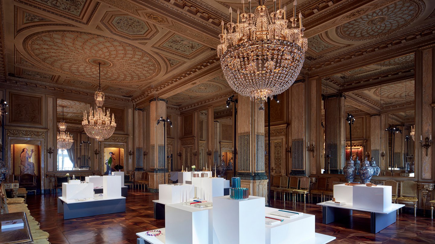
The Brera District has perhaps thrown up some of the best examples of this over the past few years, where seemingly nondescript doorways have been invitingly left ajar, leading through into lush green courtyards that serve as the entrance to ancient converted townhouses with trinkets and installations tucked within. But this year my standout winner for the best use of a building has to be the magnificent Palazzo Crespi, which was aptly chosen by the luxury crystal brand Swarovski to stage Atelier Swarovski Home .

Image: Mark Cocksedge
Constructed between 1928 and 1936 for the Crespi family, a dynasty of Milanese textile and electricity entrepreneurs, the eight-storey palace still serves as a family home to this day. Unfortunately, this meant that I wasn’t allowed to take pictures, but I can honestly say it’s the most incredible residential building I have ever been in. Absolutely everything, be it on or displayed within the building, was of the highest craft and, with it, value I’ve ever seen.
To put it into perspective, there were two of largest ever Canaletto paintings in one of the drawing rooms, and I’m pretty sure I spotted a fragment of Hitler’s bunker. Very different antiques but incredible nonetheless.
As were the pieces on show from Swarovski – functional and decorative table top objects and home accessories, as well fine crystal jewellery specially created by some of the biggest names around were presented on crisp white plinths with a juxtaposing contemporary minimalism that offset the palace’s pomp perfectly.

Image: Mark Cocksedge

Due to the sheer volume of exhibits, sometimes Milan throws up distractions; some you wish you hadn’t taken a punt on, others offer an unforgettable experience.

Located en route to Palazzo Crespi, just so happens to be Fragile Gallery . Distracted by map reading I nearly missed it, but the flash of colour in the corner of my eye whilst passing was enough to stop me in my tracks and hit reverse. Stepping through the door I was instantly kapowed by a riot of colour and pattern.
This incredible space was brought to life via the incredible mind of design behemoth Alessandro Mendini, and is a permanent Milanese cultural hot spot showing some of the most prestigious works of the twentieth century as well as, more recently, contemporary designers.
I will certainly be back to stand upon its multi-coloured floors, and surround myself with great design and pistachio coloured walls in the future. I recommend a visit!


