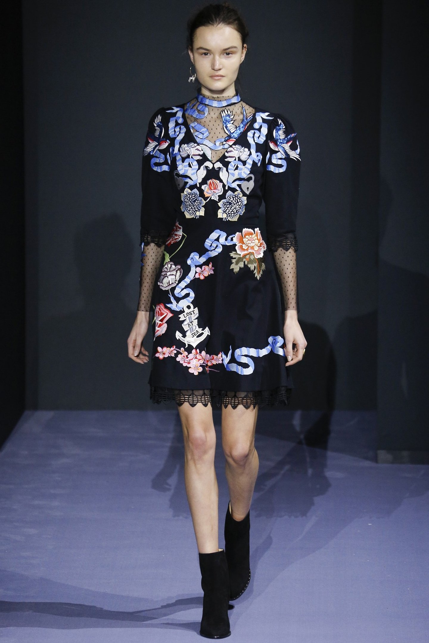
London Fashion Week offers fashion enthusiasts the chance to see what’s to come in autumn/winter 2016, and designers a chance to preemptively get their work out to the masses. The whole event is squeezed into a frenzied few days of shows across a number of venues in the capital, with many a trend being established as a result of the vibrant and varied mix of new collections working their way down the catwalk.
Whilst there are perhaps a few obvious links to surface design within the world of fashion, there are possibly less associations made with the world of interiors. But, considering that increasingly both worlds create trends for colour, style and shape/form (amongst other things), we wanted to see if we could find any telling similarities between the practices. Whether fashion or surface/interior designers are first to create the trends is certainly up for debate; design is a melting pot without clear borders after all, but with this in mind, we’ve paired up what we feel are some nice links between the disciplines and with it, some options in being able to design your spaces with a sense of cohesion to your clothes!
We spotted a number of examples of garments that were richly embellished with motifs inspired by the natural world - Flora and Fauna in particular. Many of which enhanced these elements quite dramatically by using a dark, near black, fabric base with which to work on.

Alice Archer


Kit Miles
It's a trick utilised by many wallpaper designers but we feel Kit Miles truly embodies the dark background/detailed, organic and bright embellishment the most with his intricately drawn papers and fabrics.

Christopher Kane

Alexander McQueen

Another designer that relates to this trend is Marcin Rusak, who we first spotted at Decorex last year. He makes beautiful hard surfaces from sliced layers of dark resin, which encapsulate dried flowers.

Marcin Rusak

There were a number of studios that used stitch and embroidery to create the delicate floral patterns, Victoria Beckham and Paul Smith being notable examples. They share a similar look as Custhom's Aves wallcovering, which are not only similarly rich in imagery but also share the same embroidering process.

Victoria Beckham

Paul Smith


Custhom

We noticed a fair amount of dark tones being used throughout the week but were blown away by those who did venture into colour. Anya Hindmarch and Ashish certainly didn't hold back, the latter creating a rainbow on the catwalk with models wearing block colour, each one different to the other. The chromatic variety of both as well as the square modular formations applied to Hindmarch's work, immediately brings to mind Johnson Tiles' Prismatics range.

Anya Hindmarch


Ashish

Johnson Tiles - Prismatics

Johnson Tiles - Prismatics

House of Holland
Fashion Week just wouldn't be the same without strong pattern and we found that there were a number of instances of colliding patterns merged within the same piece, such as these examples from House of Holland. This is very much in line with the surface design trends that we have seen emerging since New Designers last year, the work of Leeds graduate Benjamin Craven being a prime example.


Benjamin Craven

Benjamin Craven

Holly Fulton
We also loved Holly Fulton's use of symmetrical repeat patterns created in high contrast black and white – a design style shared by the ever-vibrant Studio Job whose wallpapers are neatly arranged and intriguingly busy in graphic detail.

Holly Fulton


Studio Job

Leaf Xia
Leaf Xia's collection was a highly confident showcase of shape and colour delivered with a clear sense of fun, something that we have again noted since last year in surface design trends, as epitomised in the interchangeable and pop-inspired surfaces of Bobenna Design.

Leaf Xia

Leaf Xia

Bobenna Design

Bobenna Design

The prize for most succinct and well-rounded colour palette from a single collection has to go to Paul Smith for us - largely because it shares in some of the rosy-peach tones of the Dulux Colour Futures Trend Heritage and Future.

Paul Smith

Paul Smith

Paul Smith


Dulux Heritage & Future Trend

Dulux Heritage & Future Trend

Zandra Rhodes
In contrast to many of the other pattern work we picked up on from the shows, Zandra Rhodes' collection was largely based around ordered, geometric formations that had an air of Art Deco imagery about them. They would work rather nicely with Daniel Heath's new Onyx Skyline wallpapers, cushions and chairs.


Daniel Heath
