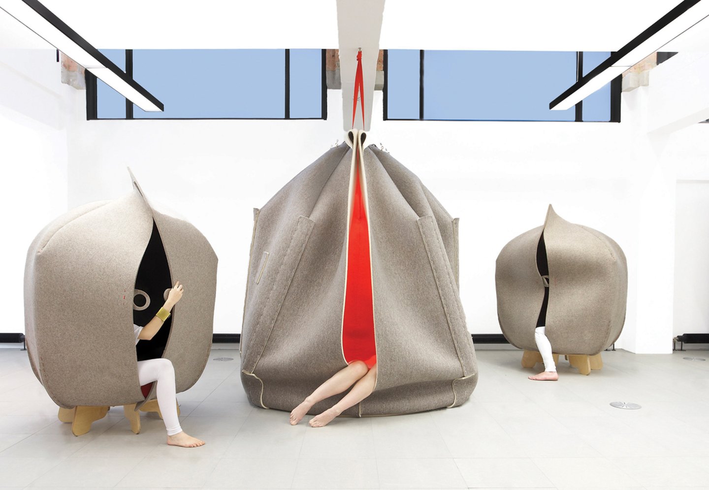
Although over 100 years old, Formica is new to the trend forecasting game. However, when it comes to the inaugural Future Vision publication, it's done a pretty good job. The team, who would normally be solely focused on the development and improvement of the brand's iconic laminates, has devised three key trends they feel anticipate specifer’s future design needs. Here we take a closer look at Personal Sanctuary.
“Seeking a place of refuge and comfort amidst unending global turbulence, we look to build more emotional connections with everyday objects, as our personal time and space become ever more precious.”
This trend is one that grew out of a response to the ever-increasing speed of lives and the cities in which we live in. The urban chaos we find ourselves in pushes more and more to seek privacy, quiet, calm and balance in our interiors spaces.

Photo: Martin Azua

Photo: Global Color Research

Photo: Daniel Schofield
The colour palette offers elegant luxury, with gentle and calm neutrals, balanced harmoniously with deeply saturated and rich colours. The juxtaposition between warm hues and cool shades make the palette both neutral and timeless.

Photo: Raw Color
In terms of material combinations, metals and metallic effects work perfectly, particularly when allowed to patina and change over time; something that develops a greater emotional connection between interior and user. Transparent and frosted materials also fit well within this trend, with such materials used to create semi-private spaces in built environments. There is a subtlety to this trend and that is apparent in the use of hard materials such as ceramic and wood mimicking softer and smoother surfaces – with it a comforting tactility emerges.

Photo: Nicolas Matheus
The recently redesigned Abbey de Fontevraud Hotel uses elements of these colour and material palettes. Designer Agence Jouin Manku also opted to reduce visual clutter by subtly integrating technology into the furniture, allowing the user of the space to be fully connected to the digital world without having the visual pressure to suggest that they should be.